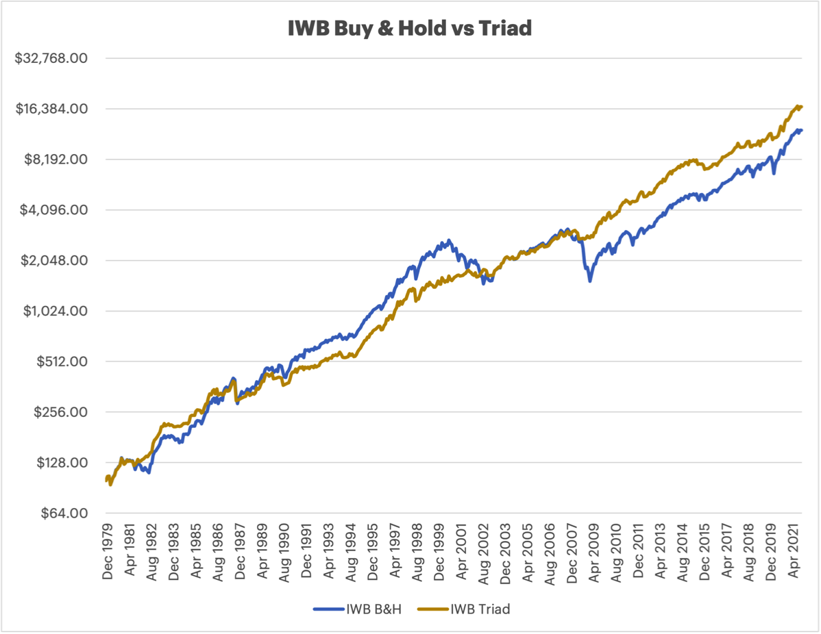
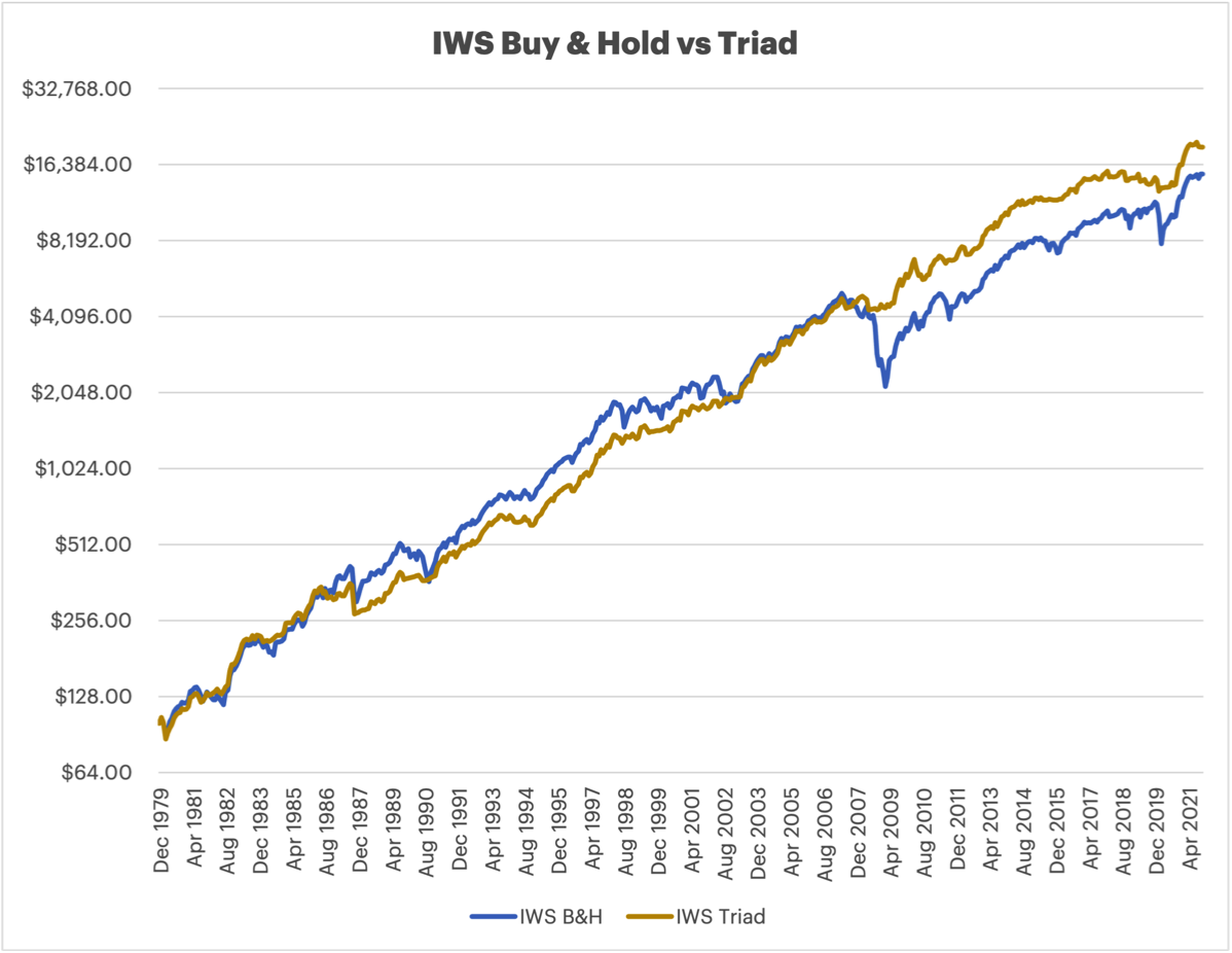
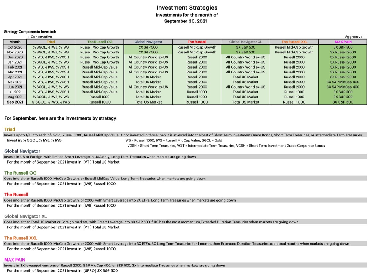
I recently highlighted the new Triad strategy and detailed how it works,
here. Investing in Triad since coming up with this strategy has made me realize that I find the potential Gold allocation to be too large, a 1/3rd position in Gold is more volatile than Triad was designed to be, and I have modified Triad going forward. Up to 1/3rd of the strategy will go into IWB, the Russell 1000, and up to 1/3rd will go into IWS, the Russell Mid-Cap Value, and up to 1/6th of the strategy will be allocated to SGOL, Aberdeen Standard Physical Swiss Gold Shares; this means that there will always be a minimum of 1/6th allocation to the best performer of VGIT, VCSH, or VGSH, Intermediate Treasuries, Short Term Corporate Bonds, or Short Term Treasuries. This reduction of the allocation to Gold only slightly reduces the long term CAGR, but reduces the Ulcer Index appreciably, as was the goal.
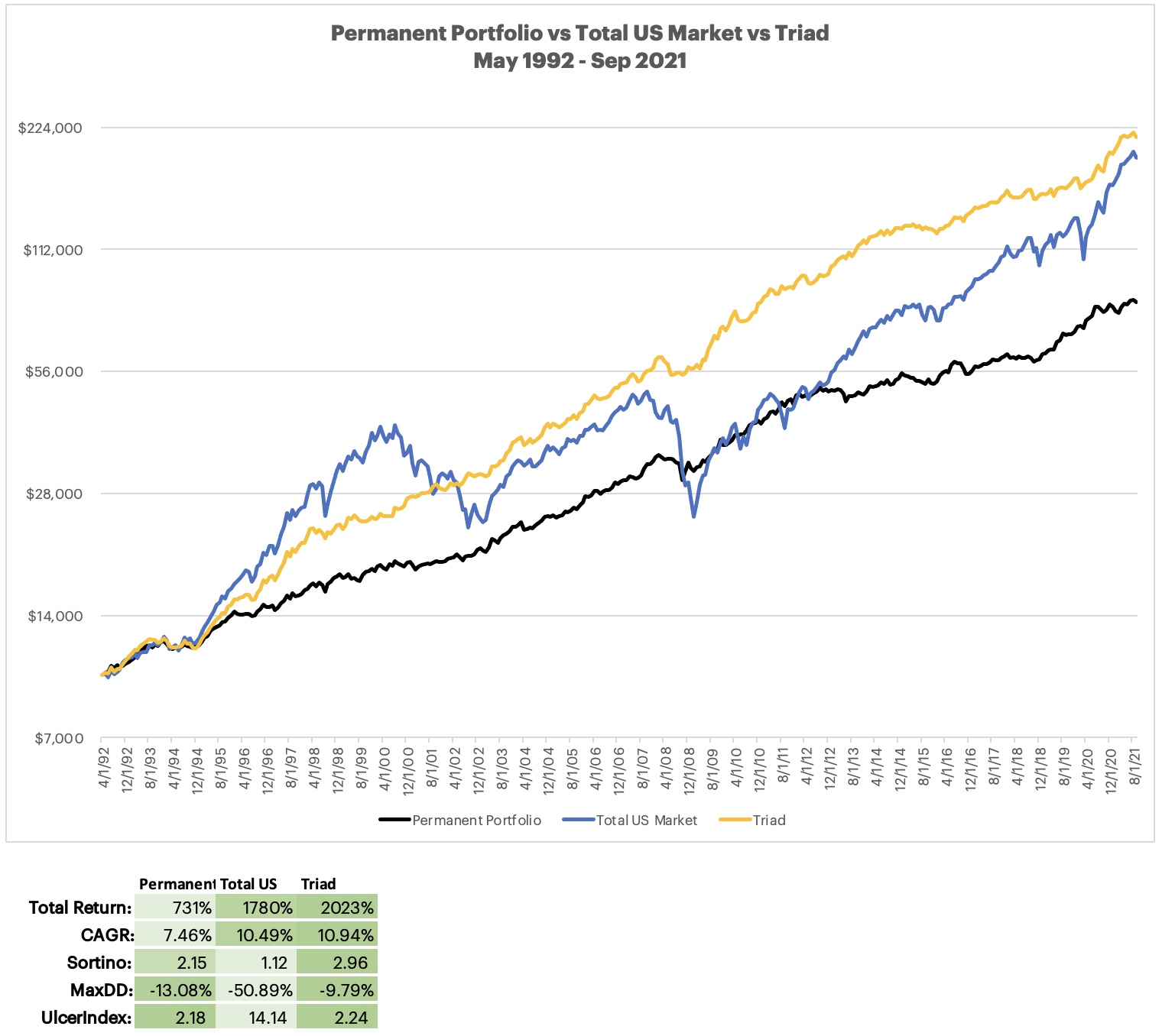
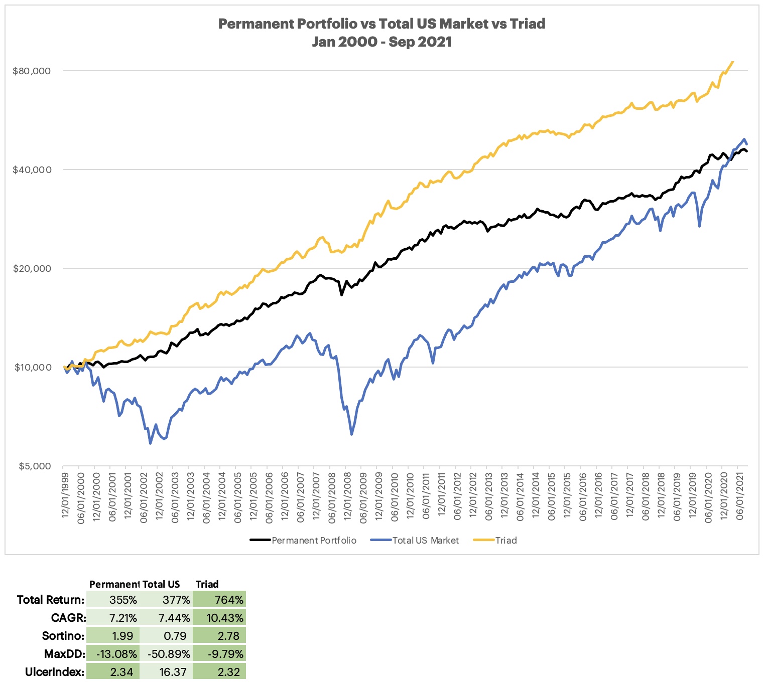
First a quick primer, why was Triad created - what was the goal? This is a conservative strategy that uses no leverage, aims to have a low ulcer index with great returns over a full investing cycle including good and bad years, it will underperform in the good years, however, it will outperform in the bad years.
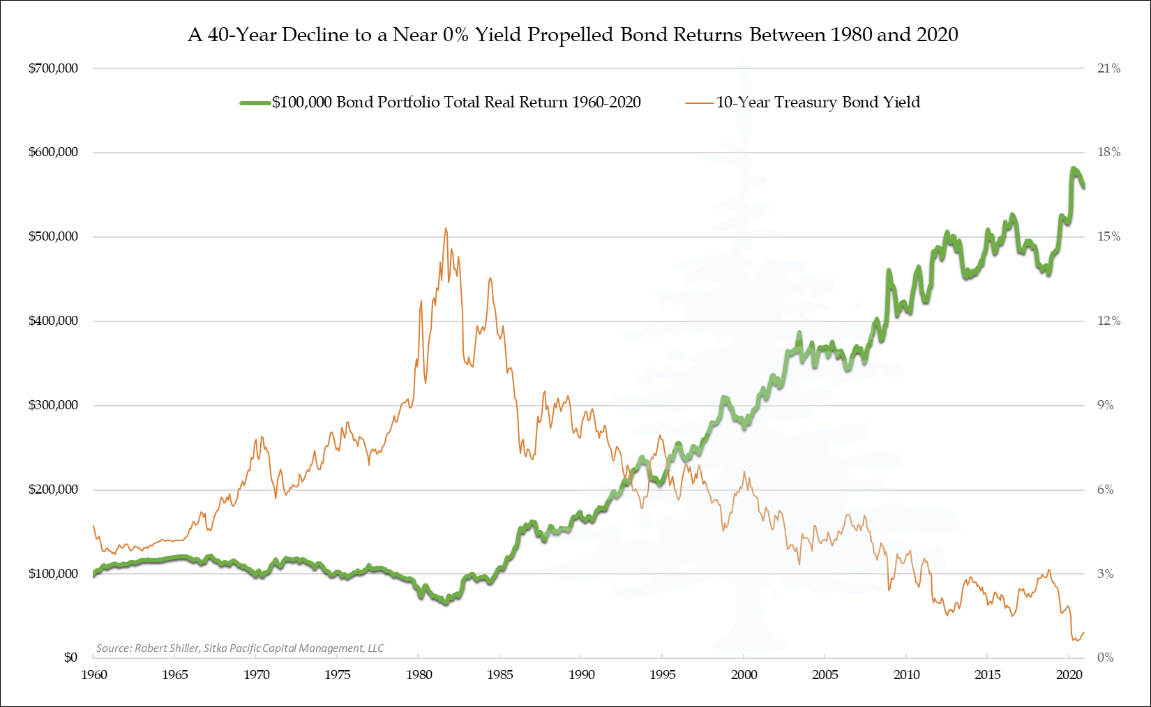
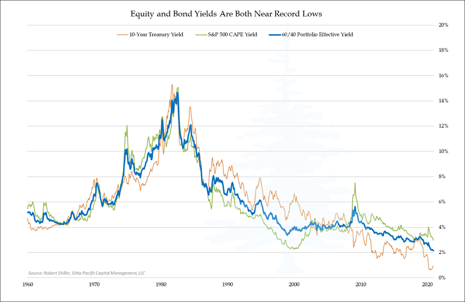
The two charts below show why a 60/40 (or a 70/30, or an 80/20) will suffer going forward, Bonds have already given what they can, there isn't much left in that allocation.