Four Regimes, Four Answers: Permanent Portfolio DMS vs the Classic Allocations
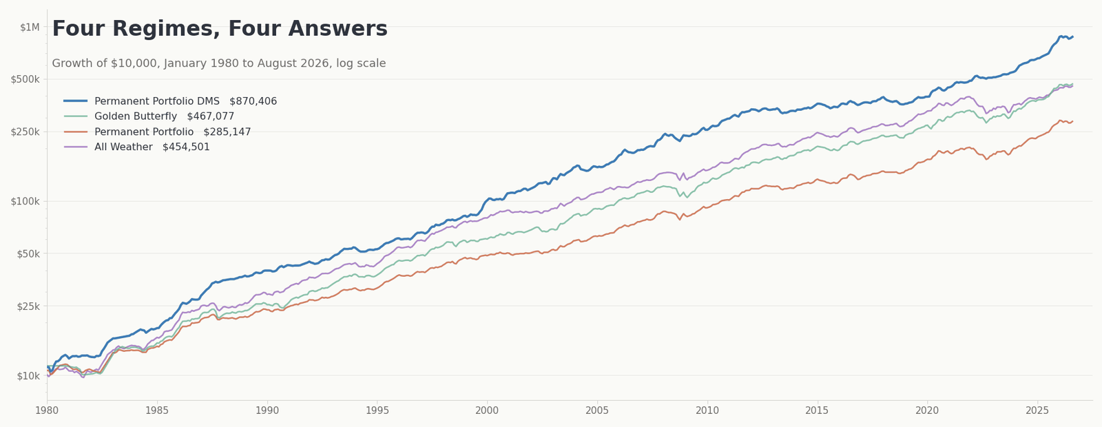
Keller & Keuning strategies were recently compared to Triad. Those are all tactical models: they read signals, they move, they go aggressive or defensive. This post is the opposite end of the site. Four portfolios that read nothing, decide nothing, and only rebalance once a year.
Harry Browne got there first. Fail-Safe Investing came out in 1981 with an argument that still holds up better than most things written since: there are four economic environments, nobody can reliably tell you which one is coming, and the rational response to that is to own something that does well in each one and stop pretending. Ray Dalio's All Weather concept is the same intuition with the bond sleeve split by duration and commodities added. Tyler's Golden Butterfly, from Portfolio Charts, keeps four of Browne's five ideas and tilts the fifth toward small-cap value.
Permanent Portfolio DMS is my attempt to build the same thing with instruments that did not exist in 1981.
All four run on the same engine, on the same return series, with the same friction. So the question answers itself, and it answers it in both directions.
The lineup
| What it holds | |
|---|---|
| Permanent Portfolio | Browne, 1981. Four equal quadrants: US stocks, long Treasuries, gold, cash. VOO / TLT / SGOL / BIL at 25% each. |
| All Weather | Dalio's concept in its unlevered public form. VOO 30%, TLT 40%, IEF 15%, SGOL 7.5%, PDBC 7.5%. Not Bridgewater's risk-parity fund, which is a different and 150% - 200% levered allocation. |
| Golden Butterfly | Tyler, Portfolio Charts. Five equal sleeves: VOO, VBR, TLT, SHY, SGOL. Browne's shape with a small-cap value tilt toward prosperity. |
| Permanent Portfolio DMS | Browne's four quadrants, modern instruments. Prosperity is long/short plus global macro equity (CLSE and HFGM, 12.5% each), recession is managed futures (DBMF 25%), inflation is gold (SGOL 25%), crisis is tail-risk convexity (CAOS 25%). |
Note what is and is not in each one. The three classics hold directional assets and put their crisis hedge in long-duration Treasuries: 40% of All Weather, 25% of the Permanent Portfolio, 20% of the Golden Butterfly. Permanent Portfolio DMS holds no nominal bond duration at all. That single difference explains most of what follows.
Ground rules
Everything below runs on the same return series with the same friction applied. Two windows appear in this piece.
The full record is January 1980 through August 2026, 560 months or 46.6 years. All four have data for the whole span, so the decade tables and the since-inception figures are like-for-like. Where I show a single rolled-up table of metrics the window is January 2000 through August 2026, 320 months. There is nothing magic about that start date beyond splitting the record roughly in half.
Now the part that cuts hardest against my own side, and I want it before the numbers rather than buried in the footer.
The data quality is not equal across these four. The classics are built from VOO, TLT, IEF, SHY, SGOL, BIL, VBR and PDBC. Those all have long, clean index histories behind them, and reconstructing them back to 1979 is close to a solved problem. Permanent Portfolio DMS is built from CLSE, HFGM, DBMF and CAOS, every one of which is a recently launched fund. Their pre-launch history leans on hedge fund and managed futures indices, and those indices carry well-documented survivorship and backfill bias that flatters returns. Nobody knows the exact size of that effect, but it is not zero and it points one way.
So read the pre-2020 numbers for Permanent Portfolio DMS as a shaded estimate rather than a measurement, and weight the recent live-fund period more heavily than the length of the backtest would normally justify. Every strategy here also had its holdings chosen with hindsight, mine included. Backtests flatter everybody.
Give them the win first
The 2010s.
Permanent Portfolio DMS compounded at +4.3% for that decade. It finished last of the four, behind All Weather at +7.8%, the Golden Butterfly at +7.7% and the Permanent Portfolio at +6.3%. A plain 60/40 returned +9.4% and beat all of them. That is a full ten years, not a partial window, and it is not a near miss.
Score the same decade on Ulcer Performance Index, the measure I weight most, and it gets worse: PP DMS at 1.03, last again, against the Golden Butterfly's 4.10 and 60/40's 4.60.
The reason is not mysterious and it is not bad luck. The 2010s were a decade in which owning plain US equity beta and long-duration Treasuries was the entire game. All Weather's 70% in stocks and Treasuries earned it +38 and +31 points of contribution over that decade. The Golden Butterfly's two equity sleeves earned +26 and +25. Permanent Portfolio DMS owns neither of those things by construction, and it spent ten years being paid modestly for hedges nobody needed.
The same design decision that cost it the 2010s is the one that saved it in 2022. I will get to that. But the cost was real and I am not going to file it under noise.
Two more concessions while I am here. All Weather beat Permanent Portfolio DMS in the 1990s, +10.3% to +9.5%. And over the trailing ten years to August 2026, 60/40 returned +9.80% a year and beat every single strategy in this comparison, the best of which was Permanent Portfolio DMS at +9.01%.
Decade by decade
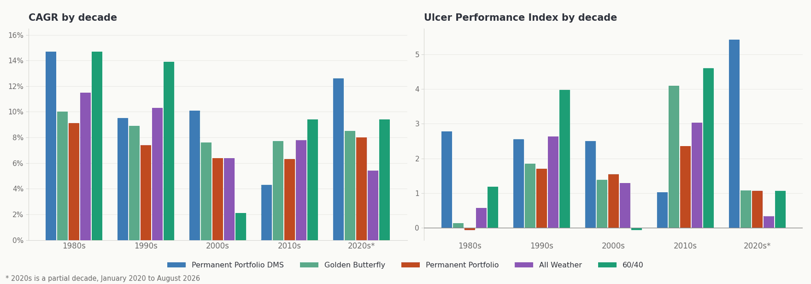
| CAGR | 1980s | 1990s | 2000s | 2010s | 2020s* |
|---|---|---|---|---|---|
| Permanent Portfolio DMS | +14.7% | +9.5% | +10.1% | +4.3% | +12.6% |
| All Weather | +11.5% | +10.3% | +6.4% | +7.8% | +5.4% |
| Permanent Portfolio | +9.1% | +7.4% | +6.4% | +6.3% | +8.0% |
| Golden Butterfly | +10.0% | +8.9% | +7.6% | +7.7% | +8.5% |
| 60/40 | +14.7% | +13.9% | +2.1% | +9.4% | +9.4% |
Permanent Portfolio DMS takes the 2000s and the 2020s outright and ties 60/40 for the 1980s. The 1990s and the 2010s go to 60/40, and in the 2010s all three classics finished ahead of Permanent Portfolio DMS as well. Note the shape of the 60/40 row: first in two decades, dead last by a mile in the 2000s at +2.1%. That is what it looks like to have one bet.
The same decades on Ulcer Performance Index.
| UPI | 1980s | 1990s | 2000s | 2010s | 2020s* |
|---|---|---|---|---|---|
| Permanent Portfolio DMS | 2.78 | 2.56 | 2.50 | 1.03 | 5.43 |
| All Weather | 0.57 | 2.63 | 1.29 | 3.03 | 0.33 |
| Permanent Portfolio | -0.07 | 1.70 | 1.54 | 2.35 | 1.06 |
| Golden Butterfly | 0.14 | 1.85 | 1.38 | 4.10 | 1.08 |
| 60/40 | 1.18 | 3.98 | -0.06 | 4.60 | 1.07 |
The 1980s column is worth pausing on. The Permanent Portfolio's UPI was negative and the Golden Butterfly's was 0.14, which means that across the whole decade neither one earned more than cash for the time it spent underwater. Both held 20-25% in long Treasuries into the back half of the worst bond market of the century. Browne published in 1981 and the first decade of his own portfolio was its worst.
September 2022
Here is the table that does more work than any other in this piece.
| Worst drawdown in 46.6 years | Depth | Peak | Trough | Months down | Months to recover |
|---|---|---|---|---|---|
| Permanent Portfolio DMS | -10.9% | Feb 2008 | Oct 2008 | 8 | 11 |
| Permanent Portfolio | -15.7% | Dec 2021 | Sep 2022 | 9 | 18 |
| Golden Butterfly | -17.3% | Dec 2021 | Sep 2022 | 9 | 18 |
| All Weather | -21.1% | Dec 2021 | Sep 2022 | 9 | 33 |
All three classics bottomed in the same month. Same peak, same trough, same nine months down. And for all three it was not merely a bad stretch, it was the worst drawdown in their entire recorded history, deeper than 2008, deeper than the dot-com bust, deeper than 1987. These are the portfolios marketed on the strength of their drawdown profile, and their worst moment was neither of the two famous bear markets. It was a year in which US stocks fell 18% and long Treasuries fell 31%.
All Weather did not make a new high again until June 2025. Thirty-three months, nearly three years, of watching an account that is supposed to weather everything sit below where it was.
Meanwhile Permanent Portfolio DMS drew down 4.8% in that same window and finished 2022 up 3.0%.
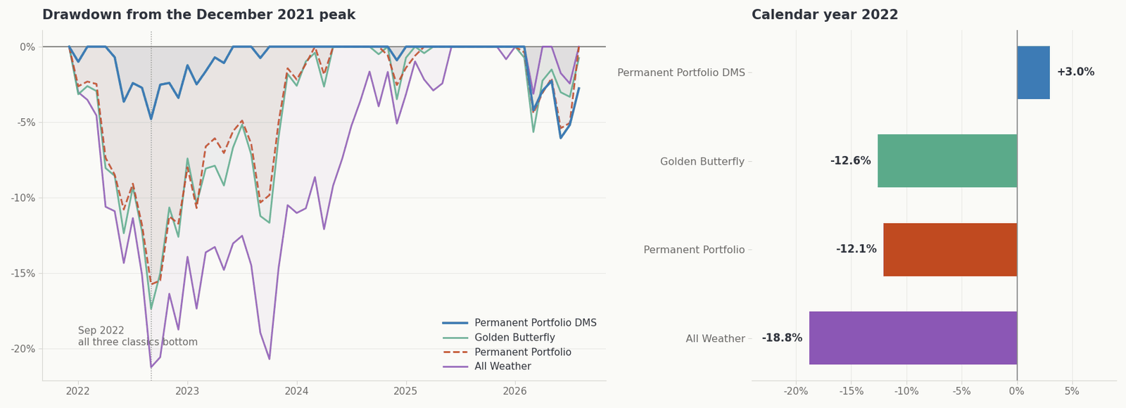
Here is 2022 broken down by where the damage came from. Figures are each sleeve's contribution to the year.
| 2022 | Total | Sleeve contributions |
|---|---|---|
| Permanent Portfolio DMS | +3.0% | DBMF +5.2, HFGM +2.2, SGOL 0.0, CLSE -0.9, CAOS -3.3 |
| Permanent Portfolio | -12.1% | BIL +0.4, SGOL -0.1, VOO -4.5, TLT -8.2 |
| Golden Butterfly | -12.6% | SGOL -0.1, SHY -0.8, VBR -1.6, VOO -3.6, TLT -6.6 |
| All Weather | -18.8% | PDBC +1.4, SGOL 0.0, IEF -2.4, VOO -5.4, TLT -13.5 |
In every one of the three classics the largest single drag was the long Treasury sleeve, and in All Weather it was larger than everything else combined. Gold, the sleeve all four of these strategies rely on for exactly this scenario, contributed roughly nothing. It did not fail, it just did not rescue anybody.
The managed futures sleeve is what made the difference. DBMF contributed +5.2 points to Permanent Portfolio DMS, because trend following is the one hedge that gets paid for a rising-rate regime rather than punished by it. That is not a clever insight on my part. It is the single most obvious gap in Browne's original design, and it is only fixable now because the instrument exists now.
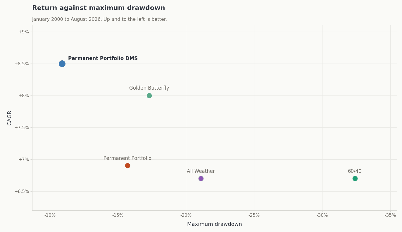
The chart that ends most of the argument
| Jan 2000 - Aug 2026 | CAGR | Max DD | Ulcer | UPI |
|---|---|---|---|---|
| Permanent Portfolio DMS | +8.5% | -10.9% | 3.11 | 2.15 |
| Golden Butterfly | +8.0% | -17.3% | 3.62 | 1.68 |
| Permanent Portfolio | +6.9% | -15.7% | 3.32 | 1.50 |
| All Weather | +6.7% | -21.1% | 4.86 | 1.00 |
| 60/40 | +6.7% | -32.4% | 7.64 | 0.63 |
Up and to the left. Over twenty-six and a half years Permanent Portfolio DMS returned more than any of the classics with roughly two-thirds of the drawdown of the best of them. The Golden Butterfly is the closest of the three classics and deserves the credit: +8.0% is genuinely competitive, and the small-cap value tilt is doing real work that the Permanent Portfolio's cash sleeve does not. It just paid for that return with a 17.3% drawdown against 10.9%.
All Weather is the outlier in the wrong direction. Same return as a plain 60/40 over the period, twice the complexity, and a drawdown that took three years to repair.
Four ways of asking the same question
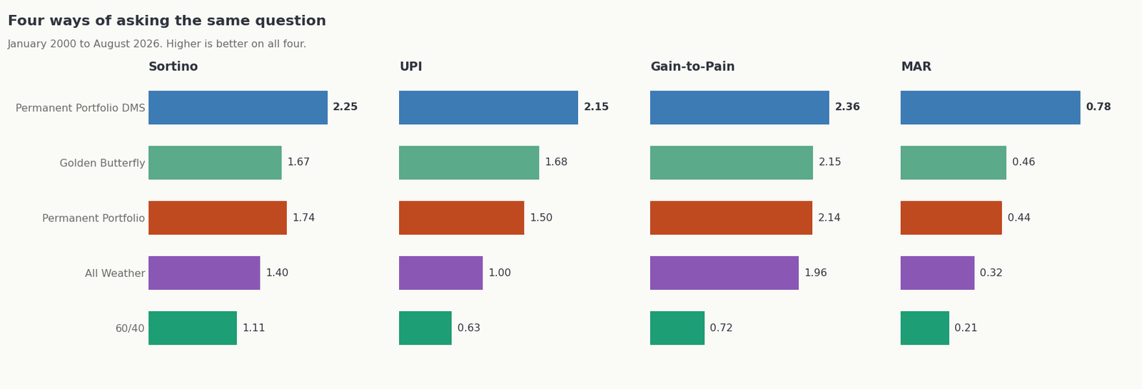
| Jan 2000 - Aug 2026 | Sortino | UPI | Gain-to-Pain | MAR |
|---|---|---|---|---|
| Permanent Portfolio DMS | 2.25 | 2.15 | 2.36 | 0.78 |
| Permanent Portfolio | 1.74 | 1.50 | 2.14 | 0.44 |
| Golden Butterfly | 1.67 | 1.68 | 2.15 | 0.46 |
| All Weather | 1.40 | 1.00 | 1.96 | 0.32 |
| 60/40 | 1.11 | 0.63 | 0.72 | 0.21 |
Sharpe is not in there on purpose. It treats a big up month as risk, identically to a big down month. Sortino counts only downside deviation. UPI and MAR both work off the drawdown itself, UPI weighting depth and duration together and MAR simply dividing return by the worst of it. Gain-to-Pain, Jack Schwager's, adds every month you made and divides by everything you gave back.
Look at the Gain-to-Pain column specifically. The four allocations run from 1.96 to 2.36, which is a tight cluster, and every one of them is far ahead of 60/40's 0.72. That column is the family resemblance. Whatever else separates these portfolios, all four are getting paid two-ish points of gain for every point of pain, and a conventional balanced fund is getting less than one.
The MAR column is where they separate, because MAR is driven entirely by the single worst moment, and the single worst moment is where the bond sleeve decided the outcome.
How they behave when it matters
Over 46 years there have been 194 months in which US equities fell. Here is the average result in those months.
| Down-equity months (194 of 560) | Average return | Positive in |
|---|---|---|
| Permanent Portfolio DMS | -0.11% | 42.8% |
| Permanent Portfolio | -0.66% | 33.0% |
| All Weather | -0.89% | 35.1% |
| Golden Butterfly | -1.22% | 27.3% |
| S&P 500 | -3.50% | - |
Narrow it to the ten worst equity months in the record, where the S&P averaged -12.4%. Permanent Portfolio DMS averaged -1.3%, the Permanent Portfolio -3.8%, All Weather -4.1%, the Golden Butterfly -6.0%. October 1987 is the cleanest single case: the S&P lost 21.7%, the Golden Butterfly lost 10.1%, and Permanent Portfolio DMS lost 5.2%.
One more measure of holdability, this one over rolling three-year windows across the whole record. The Golden Butterfly has never had a negative three-year stretch; its worst was +0.5% a year. Permanent Portfolio DMS came fractionally negative once, -0.1% a year ending September 2015. The Permanent Portfolio's worst was -1.2% a year and All Weather's was -3.1% a year, with All Weather negative over 3.0% of all three-year windows.
They are more alike than they look, except one
I ran the correlation matrix expecting a spread. What came back was more interesting.
| Jan 2000 - Aug 2026 | PP DMS | All Weather | Perm Portfolio | Golden Butterfly |
|---|---|---|---|---|
| Permanent Portfolio DMS | 1.00 | 0.57 | 0.73 | 0.63 |
| All Weather | 0.57 | 1.00 | 0.90 | 0.85 |
| Permanent Portfolio | 0.73 | 0.90 | 1.00 | 0.91 |
| Golden Butterfly | 0.63 | 0.85 | 0.91 | 1.00 |
The three classics correlate to each other at 0.85 to 0.91. They are not three approaches, they are three weightings of one approach. If you hold two of them you have diversified almost nothing, and the 2022 table above is what that looks like in practice: three portfolios, three all-time-worst drawdowns, one month.
Permanent Portfolio DMS is the only genuine outlier, at 0.57 to All Weather and 0.63 to the Golden Butterfly.
The practical reading: if you already own one of the classics and like it, adding another is close to a rounding error, and adding Permanent Portfolio DMS is a real diversification decision.
The tax section, for once, is good news
In the Keller & Keuning comparison this was the section where everything lost. Here it is the opposite, and it is the single strongest thing the whole family has going for it. Across 560 months, every one of these four rebalanced exactly 46 times, once each January, and never in any other month. Average annual turnover tops out at 4.7%, for the Golden Butterfly.
Worth noting for anyone who has read the specs: the Permanent Portfolio and Permanent Portfolio DMS both carry drift bands that force a rebalance if any sleeve falls below 15% or rises above 35%. In 46 years those bands have never once fired. In practice all four of these have behaved as pure January rebalancers.
One caveat that applies to the whole family. All four hold gold directly, and gold ETFs are taxed as collectibles at a 28% cap rather than the long-term capital gains rate. That is worth knowing before putting any of them in a taxable account.
What I take from it
First, the classics earned their reputation and the 2010s were not a fluke. A design that owns plain equity and duration beta will beat a hedged design in any decade where beta simply goes up. That describes the 2010s exactly, and Permanent Portfolio DMS finished last of five in it, three and a half points a year behind All Weather and five points behind a plain 60/40. If you believe the next ten years will look like the last ten did before 2022, the Golden Butterfly in particular has a serious case and I would not argue hard against it.
Second, the thing that decided the modern record was the bond sleeve. From January 2000 Permanent Portfolio DMS returned +8.5% against +8.0%, +6.9% and +6.7%, and did it at a maximum drawdown of 10.9% against 15.7%, 17.3% and 21.1%. More return, less pain, same window, same data, same friction. But the mechanism is narrower than those headline numbers suggest, and I would rather name it than dress it up: the classics put their crisis hedge in long-duration Treasuries, that hedge has an implicit bet on falling rates inside it, and 2022 collected on the bet. Managed futures and tail-risk convexity do not care which direction rates move. That is the whole edge. It is one idea, not several.
Third, all four risk-adjusted measures agree, and they agree by a wide margin. UPI 2.15 against 1.68, 1.50 and 1.00. Sortino, MAR and Gain-to-Pain put the same strategy on top. Consistency across four different denominators matters more to me than any single figure, because a strategy that wins on exactly one ratio has usually been fitted to it.
Fourth, and I keep coming back to this one: mine has far shakier data behind it than the other three do. VOO and TLT back to 1979 are a reconstruction problem. Hedge fund index returns back to 1979 are a reconstruction problem with a known upward bias attached. The live-fund era for CLSE, HFGM, DBMF and CAOS is short, and 2022 through 2026 is a genuine out-of-sample result that happens to look excellent. I would want another decade of it before treating the forty-six-year figure as anything firmer than suggestive.
What I would say with confidence is narrower than the tables imply, and it is this. Browne's framework was right and has aged extraordinarily well. The specific instruments available in 1981 built the recession and crisis quadrants out of long bonds and cash, because that was what there was. Those quadrants can now be built out of things that do not need rates to fall. September 2022 is the only clean test of that difference so far, and the difference showed up exactly where it was supposed to.
You can run every one of these comparisons yourself on DMS, over any window you like. That was the point of building it.
Past performance, including backtested results, is not indicative of future results. Backtested performance is hypothetical, does not reflect actual trading, and benefits from hindsight in the selection of strategy holdings, for the classic allocations and for mine alike. Substantial portions of the long-term history rely on reconstructed proxy data for funds that did not exist for the full period; this reliance is materially greater for Permanent Portfolio DMS than for the three classic allocations, and hedge fund and managed futures index data is subject to survivorship and backfill bias. Third-party allocations are implemented from published descriptions and any implementation error is mine, not the authors'.